What To Wear Tips for Spring Family Portraits | Gretchen Elaine Photography Families
WIth spring sessions booked and coming quickly, I wanted to do another series of what to wear for seasonal family sessions!
Pretty much every family session, I always get asked suggestions on what to wear. I hope this is a helpful tool for all of my families this coming spring.
Choose Comfort, Always!
This may sound obvious to some, but the more comfortable you are in what you are wearing, the more comfortable you appear in the images. The is especially true for children! I try to make the session as fun as possible, but if one person feels miserable with what they are wearing, that will make it much harder to get those great giggles and smiles!
Fabrics:
Cotton is always a great go-to especially for young kids. Try to avoid fabrics that are itchy or scratchy to avoid tugging and readjusting.
For girls, try to avoid tulle underskirts and shiny dresses like rayon or silk. Matte fabrics are much more flattering and won’t crinkle and cling to problem areas.
Shoes:
Be Practical! If your sessions is in the woods or grass, don’t wear high heels! Most of your time will be spent digging your shoes out of the ground. At parks and grassy areas, sandals are great. Your favorite pair of sneakers like converse or vans are also a great go-to.
Be Comfortable! Don’t put your little ones in shoes that aren’t broken in yet, this can lead to meltdowns and more stress that no one wants. Instead get out your tried-and-trues with softer soles. For tiny babies, have them go bare foot (as long as its warm) or socks.
2. Wear Clothes That Fit
As comfortable as they are, please do not wear baggy oversized clothing! They will make you appear to be bigger than you are in the eye of the camera. Instead wear clothes that fit well. For moms, tunics or longer shirts work great. If you don’t love your arms, opt for a 3/4 length sleeve shirt.
Absolutely NO LOGOS. Little pocket logos are fine and won’t show up.
3. Don’t Be Afraid To Layer
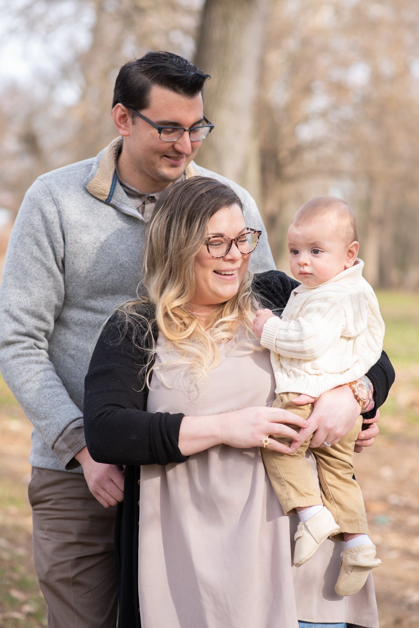
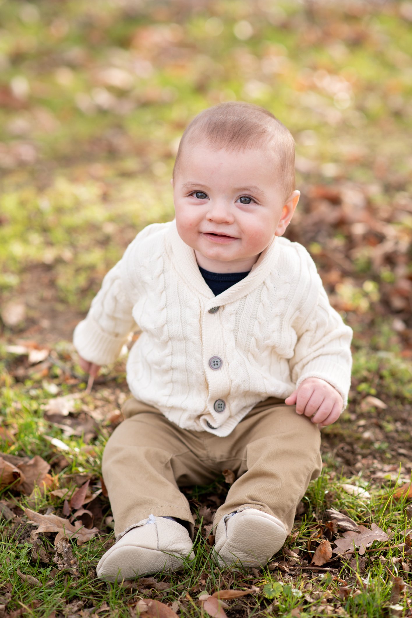
Layers can add so much dimmension to your photos and they are flattering on everyone. It can also keep you cozy if the spring weather decides to be on the chillier side. Add some texture with chunky knit cardigans, neutral colors like creams, tans, and white.
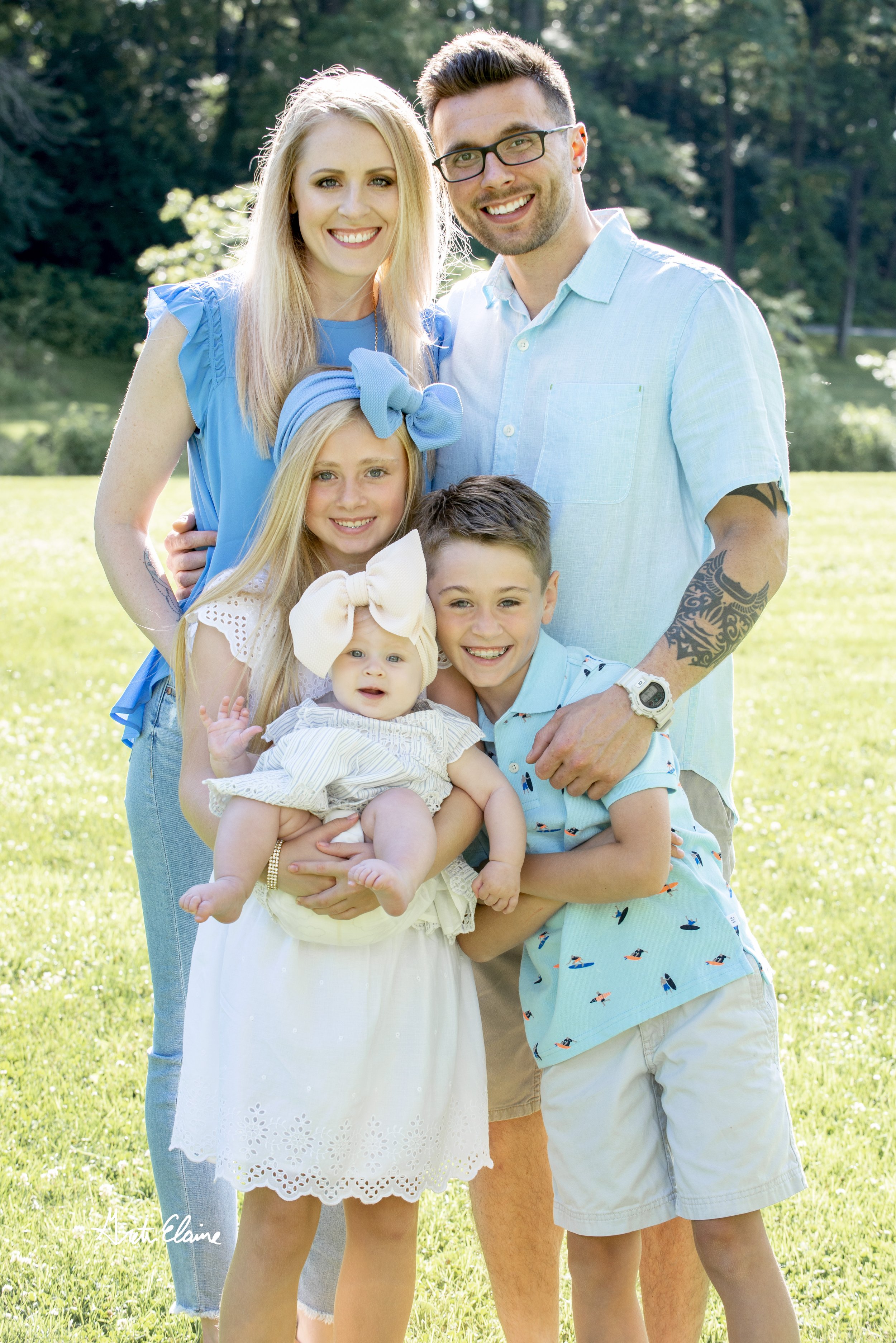
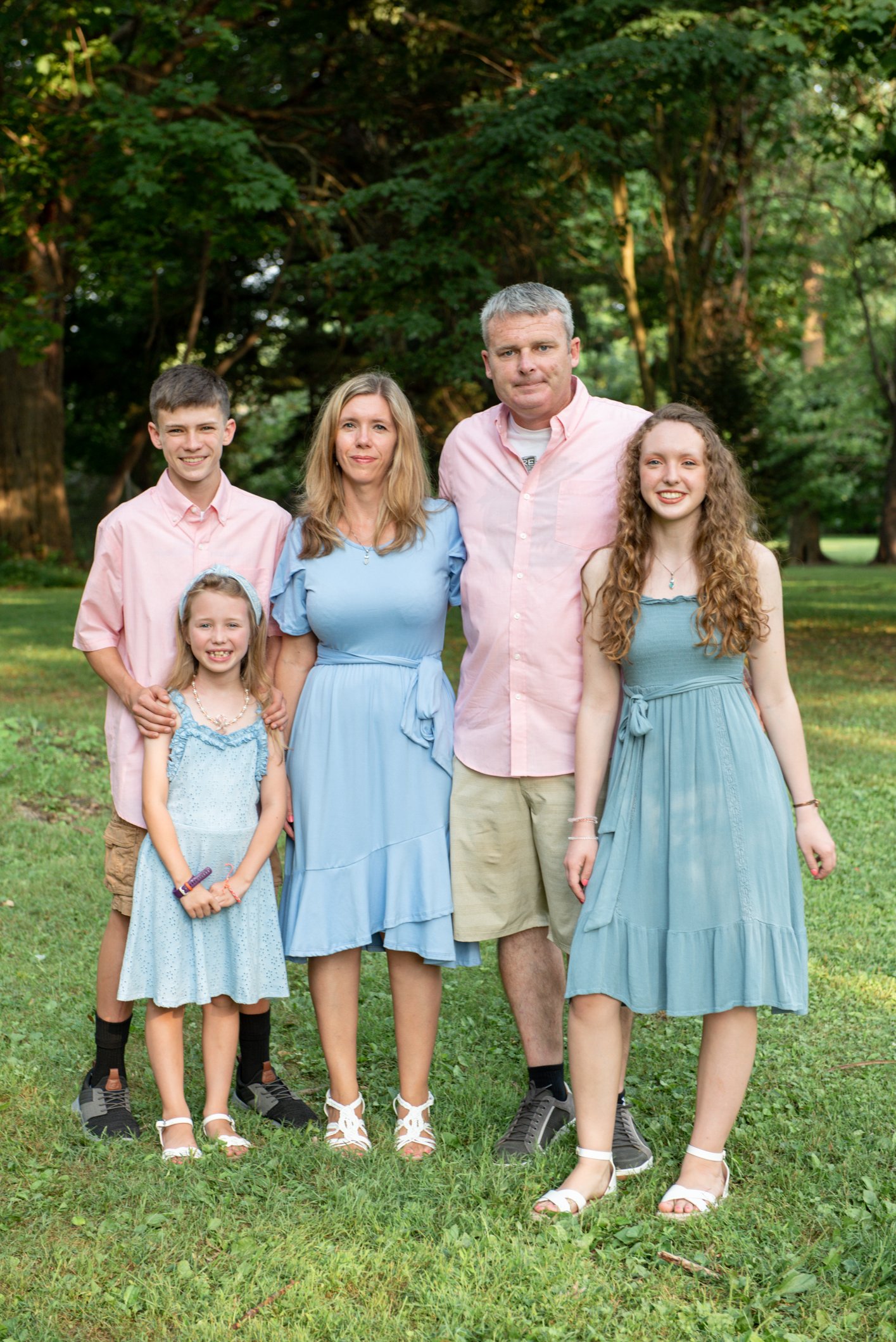
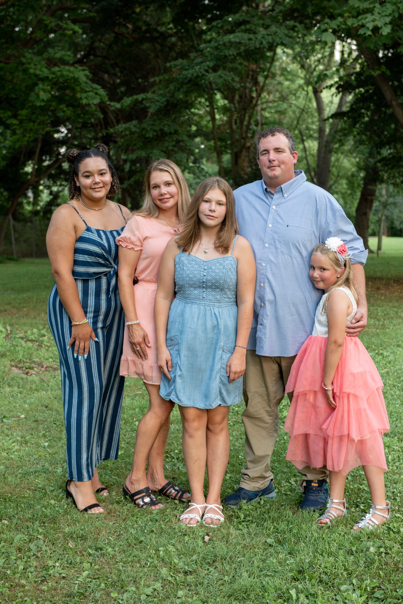
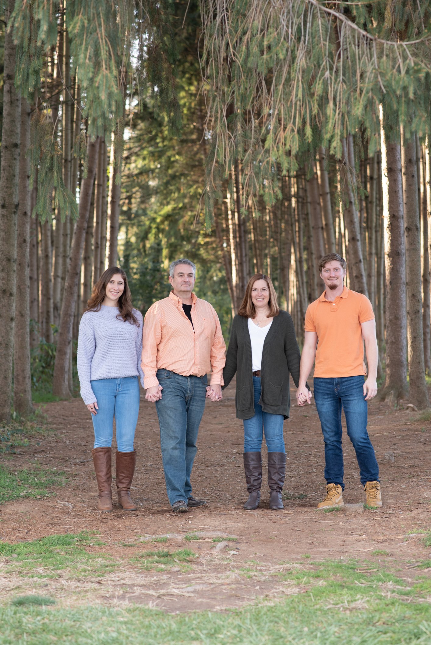
4. Coordinate In Color, Not Matching
Please, please, please do not show up in white shirts and jeans!
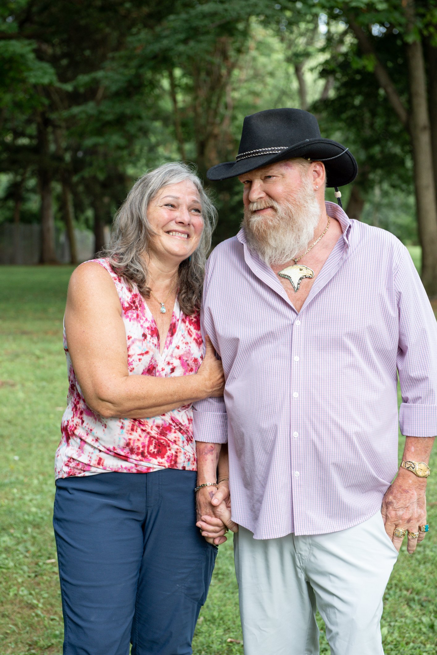
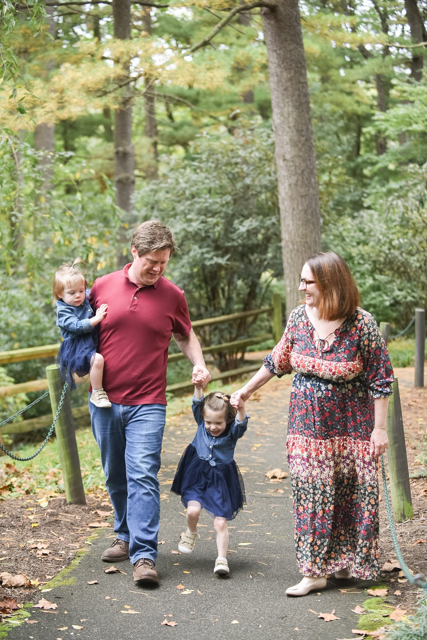
For couples and groups, coordinate with a matching color palette but avoid matching. Pick one or two colors, add neutrals that complement, and then vary patterns, textures and clothing types within that palette.
I found this awesome helpful Pick a Palette from another photographer based in wyoming!:
Pick One or Two Colors Based on the Season
For spring, I like to complement greens that are just coming out. Pink, peach, lilac and coral are good green complements.
If you’re not a pastel person, navy and burgundy photograph well year-round.
If you don’t want any color at all, go for neutral. Tans, grays, and cream still work in the spring. Just make sure you use layers and a variety of textures among family members. One or two people in the photo still should wear something in camel, dark tan or charcoal. Otherwise, everything is just too white/ivory.
Pick a Color That Will Work in Your House
We tend to decorate our houses in colors we like, so look around your house for a good jumping-off point for color.
My hope is that you will want to display your photos, so think about how the photos will look in your house. What colors will work well displayed on your walls?
Pick a Color That Complements Your Skin Tones
Find your color profile. Determine if you are a warm, cool or neutral skin tone by looking at the veins in the underside of your wrist in window light.
If the veins appear:
mostly blue, you are a cool skin tone.
mostly green or olive, you are a warm skin tone.
blue-green (possibly with some purple), you are a neutral skin tone. While neutrals can wear almost any color, muted colors tend to work best. You may also be neutral but still have tendencies to look better in warm or cool tones, depending on your eye or hair color.

You might notice that a few colors span all of the above palettes, and they tend to be the ones I recommend for photos (pinks, blues, neutrals, deeper greens).
Add Essential Neutrals
After choosing your palette, add in neutrals! This helps break up the base colors and prevents you from looking too matchy-matchy.
Examples of neutrals are tan, gray, ivory, brown, and lighter blue -jean blue.
Pants and light sweaters are always a client go-to to add in those essential neutrals!
Don’t do anything neon. No neon pink, green or really bright red either. These tones reflect the sun and give skin weird color casts and don’t show up well.
Don’t wear tight patterns. They have a moire affect, meaning that on a screen, they will jump around and have a life of their own. Avoid tight pinstripes, tiny dot patterns or tight patterns of any kind.
Adults shouldn’t wear all white (unless you’re getting married :-). If you really want all white or cream, add a sweater. Small kids are the exception here; little girls can totally get away with white or cream sundresses for a timeless, classic look.
5. Vary Textures & Patterns
Everyone has their own style and you want to show that! You can wear a variety of textures but still look like you shopped at the same store. For example, mom can wear a pretty floral dress and the rest of the family wears colors taken from that dress. This will also avoid that super matchy look!
Those are my top what to wear for spring sessions! If you have any specific questions, you can always feel free to reach out and ask. I can’t wait to see what outfits you choose for your spring session!